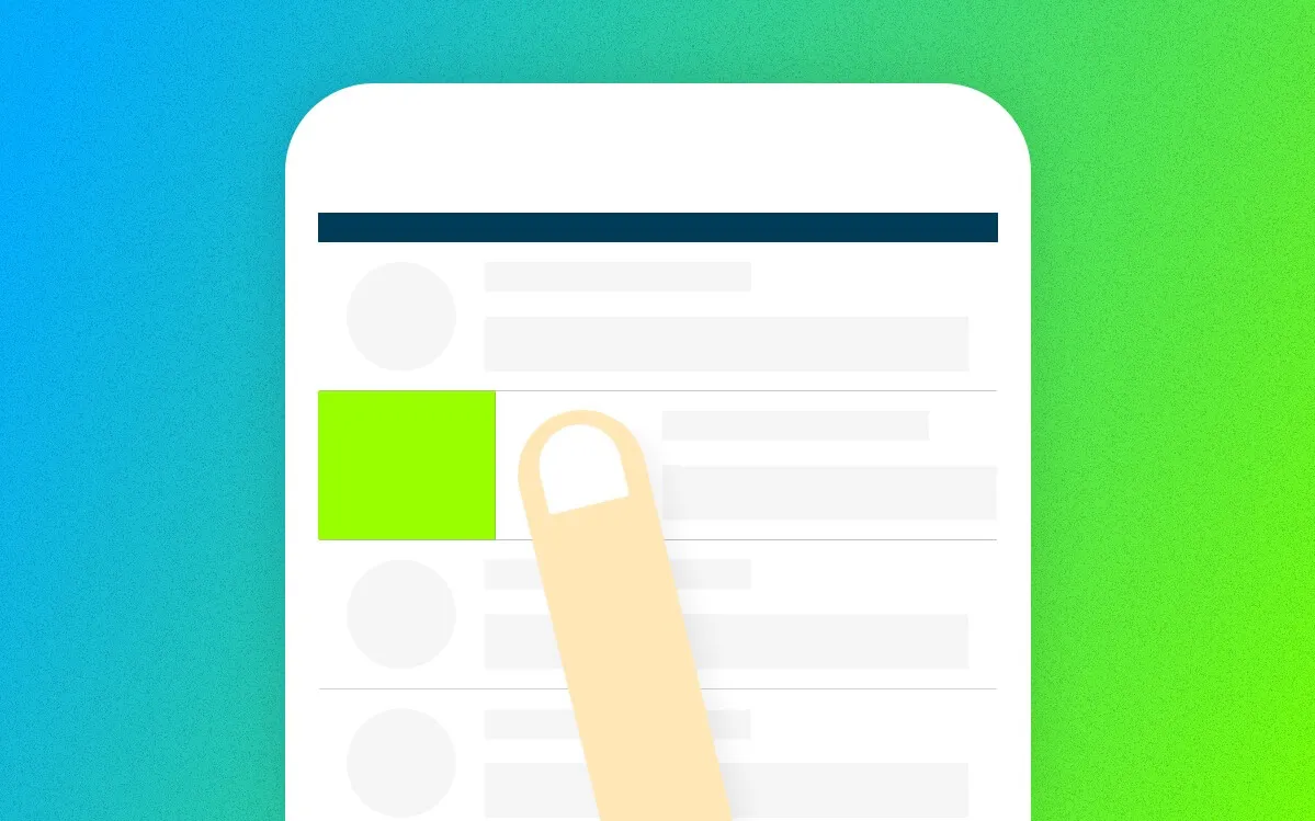
I’ve seen quite many people struggling to use an app. They didn’t know how to do a specific task on the app. They didn’t know they could do some things with an element on the screen. So here we go — these are common interactions that can be found on mobile apps these days.
P.S. This article focuses mainly on non tech-savvy users.
Types of Interaction
I’m classifying on-screen interactions (on mobile) into two major types: tapping and swiping. Note that I’m not including multi-touch gestures here as they aren’t main interactions and aren’t as common as these interactions.
Tapping
Most elements on the screen can be tapped, of course. But tapping has two types too: a normal tap and a long press.
Normal Tap
This is a very common and simple interaction everyone (probably) knows. You just tap on an element to start an action. Some examples include tapping on a button, tapping on a link and tapping on a hamburger menu.

Where You Can Tap
This interaction is applied on most elements. Such as a link, a button, a form, etc. If an object is meant to be tapped, it stands out from other objects. Hidden menus are also activated using a tap (and a swipe, too). See these examples.
- Buttons
- Links
- Forms
- Hamburger icons
Long Press
Most of the time, a long press is like a right-click on a mouse. You long-press on an element to bring up a context menu or to (multiple-) select an object.
This is found more often on Android than in other systems.

Where You Can Long-Press
On apps with list objects, like news apps and email apps, you can long-press on an item to bring up an option popup for the item. On gallery or file management-related apps, you can long-press on an object to select it and continue to select (by tapping) other items too.
For examples:
- Email: long-press to bring up a menu
- Photo gallery: long-press to select multiple photos
- Menu buttons (Android): long-press to see a tooltip that tells you what this button does.
Swiping
Swiping can bring us a hidden menu, like an off-canvas navigation menu (it is outside of the screen so you don’t see it), and also a shortcut to do some tasks.
Swiping on an Object
This kind of interaction is usually present on apps with cards, lists, photos, etc. On a card, you can swipe it to dismiss it — think of Google Now cards. On an email item, you can swipe it to mark as read or to send it to the trash.

Where You Can Swipe
Examples:
- Emails: swipe right to mark as read
- Google Now cards: swipe to put the card away
Swiping From the Edge of the Screen
Yes, you read it right. There is this way of interaction too if you haven’t known, as I mentioned earlier that “swiping can bring us a hidden menu”. You can swipe from the left (or the right) of your screen to pull in a navigation menu, which, most of the time, works in accordance with a hamburger button; and we call it a hamburger menu.
For examples:
- Off-canvas menu: swipe from the left edge of the screen
- Control Center (iOS): swipe from the bottom edge of the screen
That’s all for this article. Hope it helps some smartphone users to understand the basics of mobile app interactions and use the phones more efficiently.
